JakPod Hotel Design
The client
JakPod Hotel is a pod hotel in Thamrin, central Jakarta, part of the Capsule Indonesia family.
What we made
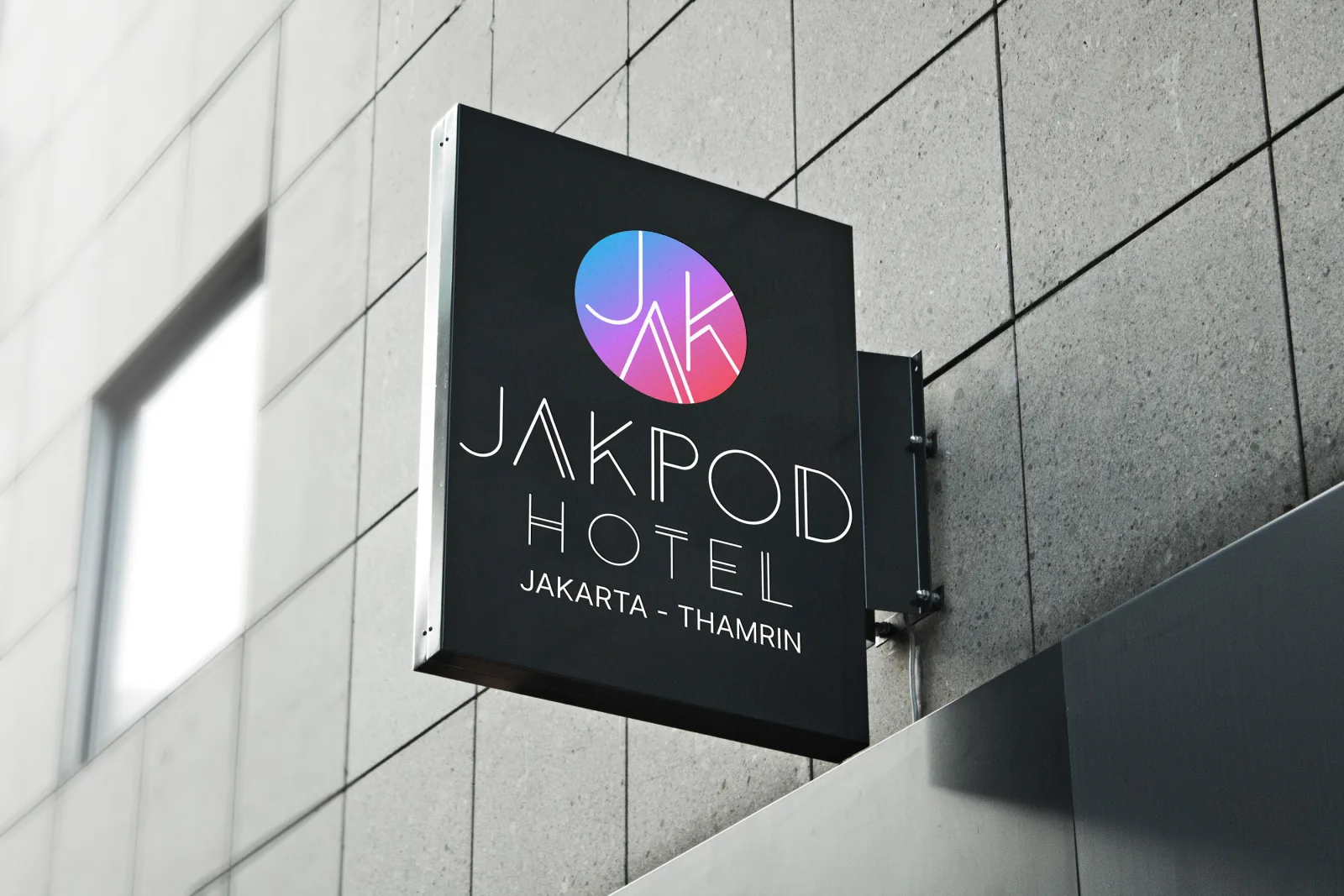
We designed its identity: a JAK monogram in a pink-to-blue gradient circle with a thin line-art wordmark, shown here on the hotel’s street sign.
- The monogram. J, A and K drawn in thin lines and interlocked inside a gradient circle.
- The wordmark. JAKPOD HOTEL in a thin, geometric line style that matches the monogram.
- The location line. “Jakarta - Thamrin” set plainly under the wordmark.
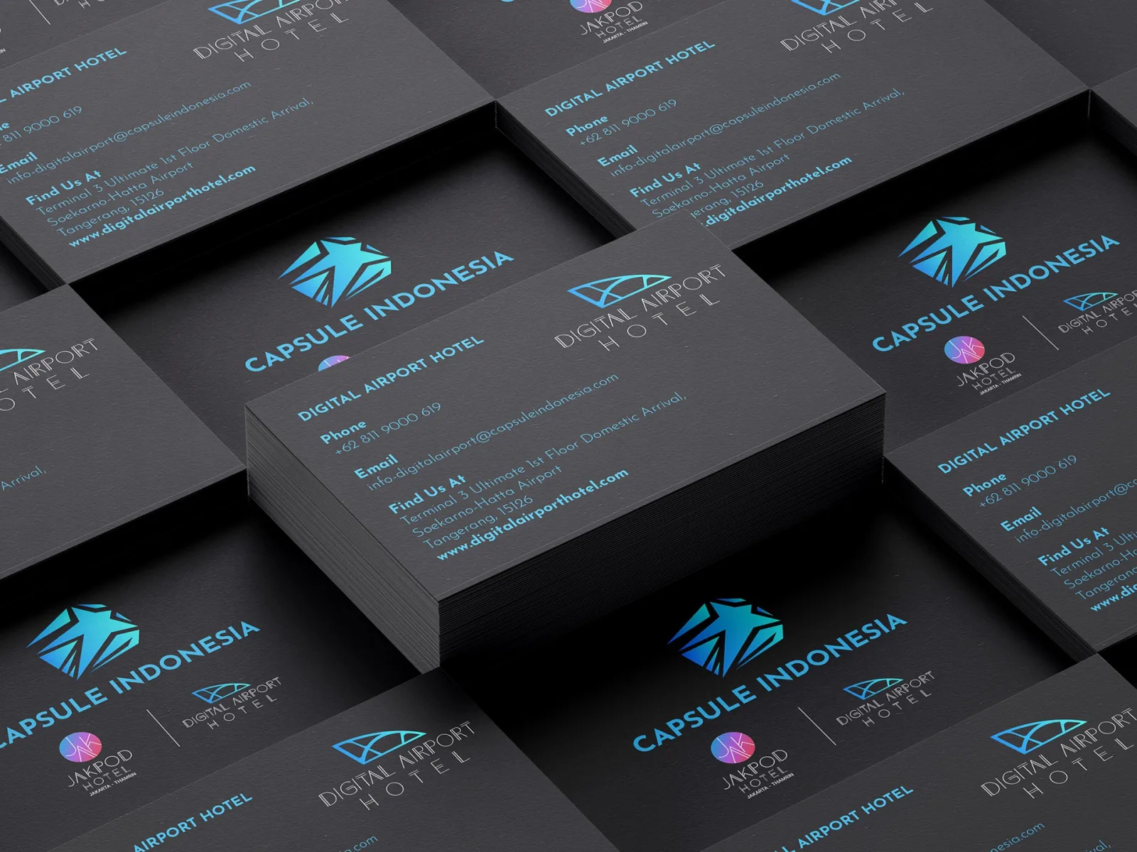
- In use. A black lightbox sign on the street, and the hotel’s place on the Capsule Indonesia family’s business cards.
How we approached it
A pod hotel sells something new and compact, so the identity needed to feel modern without looking cold. The thin lines keep the mark light, the gradient gives it warmth at night on a black sign, and the monogram still reads when it is printed small next to the group’s other brands.